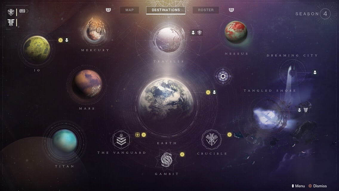
On August 28th, Bungie will be deploying yet another redesign to the destination director (or director for shorthand), to accommodate new destinations coming in Forsaken. Places like The Tangled Shore and The Dreaming City, as well as new activities like Gambit. As a designer, the long-standing tradition of director redesigns is one of the features I most anticipate with any new major content update.
- Destiny 1 launch director.
- Destiny 1 director after the Taken King update.
- Destiny 2 current director.
Directing the Fun
The destination director is an interface that arranges the game’s various destinations and activities. It also tags each activity and destination with alerts and the number of friends that are currently there. This allows you to get a snapshot of what’s going on and where you might want to go.
You can argue the director is the single most important interface in the entire game. Mainly because it is responsible for guiding the player to their next activity. In a game with so many different things to do at any given moment, it’s in the hands of the director to present those options in a visually meaningful way. Not only to bestow confidence on to the player’s path, but to ensure it all doesn’t become overwhelming. In Forsaken there will be more to do in Destiny than ever before. So let’s take a quick journey back to the beginning; for a better understanding on how the Forsaken destination director meets those challenges.
Straight To The Point
David Candland is a Senior Designer at Bungie, and one of the leads responsible for the game’s user interface. At the time, Destiny presented a very unique cursor-based interface, not commonly seen on consoles. It dared to choose the path of simplicity and cleanliness, hiding vital information in tool tips that pop up when you hover over an element. This allows you to get a very clear picture of your loadout and inventories.
The cursor also allows you to move directly to what you need without having to click several times in different directions. The UI has always been one of my favorite and most revered parts of Destiny. It’s very clear that a lot of thought and work went into the development of Destiny’s user interface. Candland outlines the full story of its development in a talk at the 2016 Game Developer’s Conference.
David’s work extends to the director interface, and enables players to quickly and efficiently find their next adventure. The first director was magnificent to behold. I had never seen anything like it. Seeing the planets of our solar system arranged in that way helped sell the fantasy of being a guardian. It really felt like you were setting out on an adventure to push back on invading forces, rediscover humanity’s lost secrets, and reclaim our system.
It gave you the sense of freedom that I had craved to see in a sci-fi game. Perhaps that is one of the things that kept me playing it for so long. That and Gjallarhorn of course. Destiny 1’s directors also included a quick access area, allowing you to launch into specific activities that were on a weekly rotation.

If It Ain’t Broke
Fast forward to Destiny 2. With 4 completely new destinations, Bungie hit the reset button on the director layout. They also replaced the quick access bar with a brand new milestones tab; a feature implemented to track your major points of progress. This way you could determine what to do next in the same interface that would get you there. The original intention was to guide you through your progress.
In year 1, that was simply a pursuit of power, which is considered one of the design flaws of year 1’s investment system. It promoted a handful of power pursuits, granting completely randomized rewards. It added to the absence of a real sense of accomplishment, especially once you finished those activities for the week.

The new director coming in Forsaken
Back to Basics
With a major shift towards driven pursuits in Forsaken, the new Director naturally reflects this. The milestones tab now only features major non-replayable quests and campaigns, with your pursuits of power now brightly indicated by a yellow icon on each destination. This change invites players to further explore destinations, with the power grind taking a more passive back seat.
The Forsaken director shifts most destinations to one side, reserving the focus of the right side for the two new destinations. Additionally, the 3 activities have been moved to the bottom for a more organized look. The Leviathan raid has also been pushed inside of the Nessus map itself, which makes sense considering it will not be updated for year 2.
Overall, the new director looks incredible as usual. More importantly though, it does its job in presenting the addition of new content in an efficient visual way. Destiny 2: Forsaken releases September 4th.


